UX case study · Website + mobile
Simplifying
ticket booking.
Redesigning TicketsPi to elevate the entertainment experience and unlock revenue opportunities.
Gnapi Technologies / Product & UX design
Explore the screens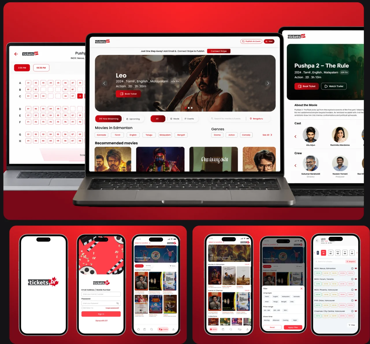
- Year
- Nov 2024 - Mar 2025
- My role
- UXUI Designer
- Tools
- Figma · FigJam · Adobe Photoshop · Adobe Illustrator
- The source
- Case study in Figma ↗
Heuristic Evaluation · UX Research · Prototyping · Responsive Design · Design System · Developer Handoff · Mobile Application
01 / The product
One platform. Two sides of entertainment.
TicketsPi is a digital platform for movie and event booking across Canada. Its mission is to make connecting with entertainment quick, enjoyable and rewarding. The product supports two roles within one experience: people can attend an event or create and manage one themselves.
Discover. Book. Enjoy.
Find movies and events, choose a showtime and seats, pay securely, and keep tickets close at hand.
Launch. Track. Grow.
Publish entertainment, monitor ticket sales and revenue, and manage audiences in a self-service marketplace.
The differentiator
TicketsPi brings discovery, ticket purchase and event publishing into one self-service marketplace. An individual or business can move from attending entertainment to launching an event, monitoring ticket sales and tracking revenue within the same ecosystem.
Why the redesign started.
Personal frustration and user feedback pointed to the same problem: the booking process felt fragmented. Finding an experience, choosing seats, applying an offer and paying needed to feel like one connected journey.
That became the design challenge: simplify the attendee’s decisions while making the platform more useful for the organizers creating those experiences.
02 / The challenge
A fragmented journey was getting in the way.
The booking experience was fragmented and time-consuming. Searching, selecting seats, applying offers and completing payment felt disconnected, with users dropping off before the final booking. Personalized deals were difficult to discover early in the journey, while snacks and add-ons remained underused. These gaps affected both the customer experience and revenue potential.
Simplify the booking flow
Reduce steps and friction between searching, selecting and paying.
Improve clarity and speed
Strengthen visual hierarchy and interface clarity so the next action is easier to understand.
Make seat selection intuitive
Use legible seating visuals and clear interaction feedback to support confident choices.
Encourage people to return
Create opportunities for loyalty and personalized recommendations that support engagement and retention.
Support relevant revenue opportunities
Improve cross-sell and upsell pathways so useful offers and add-ons have a clearer place in the experience.
The goal was a booking journey that feels clear at every decision—and a marketplace that gives both attendees and organizers a reason to return.
03 / Design process
From friction to a focused flow.
The redesign began by understanding where the existing experience created friction. Heuristic evaluation, secondary research and journey mapping shaped the structure; wireframes and high-fidelity designs made the response tangible. Prototyping, user feedback and iteration connected those decisions back to the booking experience.
Heuristic evaluation · Secondary research · User journey
First, understand the journey as a whole: where people lose context, which decisions feel unclear and what organizers need to manage.
Information architecture · Low-fidelity design · High-fidelity design
Then translate those priorities into information architecture, wireframes and a consistent interface across website and mobile.
Prototype · User testing & feedback · Iteration
Finally, make the flow testable through prototypes, collect feedback and iterate on the experience before extending it further.
04 / Key findings
Five issues. Five design responses.
The heuristic evaluation revealed five connected issues: unclear status, unfamiliar language, inconsistent patterns, limited organizer control and competing visual elements. Together, they shifted the design focus toward clear decisions and visible feedback throughout the journey.
- 01
System status
Unclear availability created uncertainty.
Show availability and immediate seat-selection feedback.
- 02
Familiar language
Technical terms slowed choices.
Use simple labels and recognizable icons.
- 03
Consistency
Controls and navigation varied across screens.
Align buttons, typography and navigation patterns.
- 04
Efficiency
Organizers needed clearer tracking and control.
Make sales and revenue information easier to monitor.
- 05
Visual simplicity
Competing elements diluted priority.
Reduce clutter and emphasize the next action.
05 / Experience structure
A clear path on every screen.
The experience is organized around a shared sequence of decisions. The website gives choices room for comparison; responsive layouts focus each step into a smaller viewport. Account access, availability and cancellations branch from the journey, then return people to a meaningful next action.
WEBSITE
- Discover
- Movie details
- Language
- Showtime
- Seats
- Contact
- Payment
- Confirmation
MOBILE
- Location
- Discover
- Movie details
- Showtime
- Seats
- Review
- Pay
- Ticket
AFTER BOOKING
- My tickets
- View / share
- Cancellation request
- Request status
ORGANIZER
- Dashboard
- Event performance
- Audience
- Financials
- Operations
06 / Website discovery
Make discovery inviting, even before a movie is chosen.
The first problem is orientation: what can I book, and where? Featured entertainment, separate movie and event collections, search and location controls give the visitor several useful starting points. The empty-state redesign keeps that invitation alive when local movie content is unavailable.
Redesigned homepage
Turn a broad interest in entertainment into a shortlist.
Design notes
- Why this design
- Featured content and separate movie/event collections support quick scanning before deeper exploration.
- Next step
- Open a movie or event; use search or filters to narrow the choice.
Keep discovery useful when there is nothing to book.
The empty-state redesign explains local availability and gives the attendee another direction to explore.
07 / Website booking
From movie discovery to a confirmed ticket.
Once a movie is chosen, the interface turns one large purchase into smaller decisions: viewing version, cinema, session, seat and payment. Each screen carries forward what has already been chosen, so the attendee can verify the plan before committing. Read left to right, then down.
Explore the movie
Understand the experience before starting a booking.
Design notes
- Why this design
- The overview combines synopsis, cast and trailers with a clear Book Ticket action.
- Next step
- Choose Book Ticket, then select language and format.
Choose language & format
Avoid booking the wrong language or format.
Design notes
- Why this design
- A contextual selection sheet asks for viewing preferences before the showtime decision.
- Next step
- Continue to cinemas and showtimes for the chosen version.
Choose a showtime
Fit the movie into a real time and place.
Design notes
- Why this design
- Date controls, theatre search, session buttons and availability labels support comparison.
- Next step
- Select a showtime; continue to seat or quantity selection.
Explore available seats
Choose a position with confidence.
Design notes
- Why this design
- Row labels, a screen marker and availability states help the attendee understand the room.
- Next step
- Select available seats; the selection summary becomes the next checkpoint.
Confirm selected seats
Check that the chosen places match the plan.
Design notes
- Why this design
- Selected seats are distinguished from available and booked seats; the ticket count and amount accompany the next action.
- Next step
- Continue to the booking review and contact details.
Add contact & review
Catch mistakes in the show, seats and contact details.
Design notes
- Why this design
- A ticket summary, contact form, offer field and cancellation information gather purchase decisions in one place.
- Next step
- Confirm the details and continue to payment.
Complete payment
Finish the purchase with the booking context intact.
Design notes
- Why this design
- Payment fields and a clear pay action form the final purchase step after the review.
- Next step
- Submit payment; successful completion leads to confirmation.
Get the ticket
Use and share the purchased ticket.
Design notes
- Why this design
- The ticket brings together the booking ID, venue, date, seats and QR code with utility actions.
- Next step
- Download or share it; return through My Tickets later.
08 / Mobile app
Get people to the entertainment they came for.
The app starts by establishing recognition, account access and local relevance. After that, home and event discovery lead toward a specific session. Sign-in is an account branch; location determines the catalogue the attendee sees. The full atlas includes verification, search and recovery states.
Launch
Recognize the product before browsing.
Design notes
- Why this design
- A focused brand screen introduces the experience without asking for a decision.
- Next step
- Continue to discovery or account setup.
Sign in
Continue after entering a mobile number.
Design notes
- Why this design
- The filled field and Get OTP action make the immediate next step explicit.
- Next step
- Receive a code and open OTP verification.
Set location
See movies, events or stores relevant to a place.
Design notes
- Why this design
- Location permission is explained through its benefit, with a secondary way to continue.
- Next step
- Use location access or choose a city manually.
Browse home
Turn a broad interest in entertainment into a shortlist.
Design notes
- Why this design
- Featured content and separate movie/event collections support quick scanning before deeper exploration.
- Next step
- Open a movie or event; use search or filters to narrow the choice.
Discover events
Explore experiences beyond movie screenings.
Design notes
- Why this design
- Event cards surface the organizer and language while current/upcoming controls narrow the catalogue.
- Next step
- Open an event or filter the list.
Choose showtime
Fit the movie into a real time and place.
Design notes
- Why this design
- Date controls, theatre search, session buttons and availability labels support comparison.
- Next step
- Select a showtime; continue to seat or quantity selection.
09 / Responsive booking
The same journey, made for the palm of your hand.
On a narrow screen, the same booking decisions need a tighter hierarchy. Contextual sheets handle secondary choices, the seat state makes selection visible and the review step reconnects the show, contact details and total. This responsive website sequence ends with a usable QR ticket.
Movie overview
Understand the experience before starting a booking.
Design notes
- Why this design
- The overview combines synopsis, cast and trailers with a clear Book Ticket action.
- Next step
- Choose Book Ticket, then select language and format.
Language & format
Avoid booking the wrong language or format.
Design notes
- Why this design
- A contextual selection sheet asks for viewing preferences before the showtime decision.
- Next step
- Continue to cinemas and showtimes for the chosen version.
Choose showtime
Fit the movie into a real time and place.
Design notes
- Why this design
- Date controls, theatre search, session buttons and availability labels support comparison.
- Next step
- Select a showtime; continue to seat or quantity selection.
Available seats
Choose a position with confidence.
Design notes
- Why this design
- Row labels, a screen marker and availability states help the attendee understand the room.
- Next step
- Select available seats; the selection summary becomes the next checkpoint.
Selected seats
Check that the chosen places match the plan.
Design notes
- Why this design
- Selected seats are distinguished from available and booked seats; the ticket count and amount accompany the next action.
- Next step
- Continue to the booking review and contact details.
Review & contact
Catch mistakes in the show, seats and contact details.
Design notes
- Why this design
- A ticket summary, contact form, offer field and cancellation information gather purchase decisions in one place.
- Next step
- Confirm the details and continue to payment.
Payment
Finish the purchase with the booking context intact.
Design notes
- Why this design
- Payment fields and a clear pay action form the final purchase step after the review.
- Next step
- Submit payment; successful completion leads to confirmation.
Confirmation
Know that the purchase completed.
Design notes
- Why this design
- A prominent confirmation message resolves uncertainty at the end of checkout.
- Next step
- Open the ticket for download, sharing or entry.
QR ticket
Use and share the purchased ticket.
Design notes
- Why this design
- The ticket brings together the booking ID, venue, date, seats and QR code with utility actions.
- Next step
- Download or share it; return through My Tickets later.
10 / After booking
The experience continues after payment.
Payment changes the attendee’s goal from buying to being ready. Tickets become the place to retrieve admission details and share them. When plans change, cancellation introduces a separate journey: understand the policy, make a request, track progress and read the outcome.
My tickets
Return to a booking without repeating discovery.
Design notes
- Why this design
- Ticket cards group the event, time, venue and seats so the attendee can identify the right purchase.
- Next step
- Open ticket information, share it or start an eligible cancellation.
Ticket information
Check the purchase details after booking.
Design notes
- Why this design
- A contextual information panel separates ticket price, fees and the amount paid.
- Next step
- Close the panel to return to the ticket and its actions.
Share a ticket
Coordinate attendance without re-entering booking details.
Design notes
- Why this design
- A share sheet presents copy-link and messaging options while retaining the ticket context.
- Next step
- Choose a sharing method, then return to the booking.
Request cancellation
Specify which tickets should be cancelled.
Design notes
- Why this design
- Seat selection, a reason field and a reminder about cancellation limits make the request deliberate.
- Next step
- Submit the request and monitor its status.
Track the request
Know that a submitted request is awaiting an outcome.
Design notes
- Why this design
- A pending status keeps the affected booking visible and distinguishes a request from a completed refund.
- Next step
- Return to the request status or open booking information.
View the outcome
Check the outcome of a cancellation request.
Design notes
- Why this design
- The result connects the refund message, amount, method and date to the original booking.
- Next step
- Review remaining valid tickets or retain the refund record.
11 / Organizer experience
Make running an event part of the same ecosystem.
Behind every attendee journey is an organizer maintaining the event. The product connects event setup with performance reporting, promotions, cancellation handling and admission. Populated screens show those decisions; unfinished analytics destinations are labelled as source drafts in the atlas.
Read event performance
Understand how events are performing.
Design notes
- Why this design
- Sales, attendance, ratings and event status share one overview, connecting revenue with participation.
- Next step
- Filter the overview or investigate top events and audience insights.
Understand event performance
See which events drive attendance and revenue.
Design notes
- Why this design
- A ranked table pairs results with engagement counts, connecting discovery, booking and check-in.
- Next step
- Use the comparison to inspect an event or explore audience composition.
Understand the audience
Distinguish new and existing attendees.
Design notes
- Why this design
- A simple audience split turns attendance into a retention question.
- Next step
- Use this view alongside event performance when planning future campaigns.
Scan at the venue
Validate entry at the correct event and session.
Design notes
- Why this design
- The scanner retains event, venue and time context around the camera target.
- Next step
- Read the ticket and review the recognized attendee.
12 / Flexible booking
Three booking methods. One consistent experience.
The original product supports Basic, Normal and Dynamic booking. The redesign applies clearer hierarchy and booking feedback across these existing methods.
Basic
A focused route through the core booking steps.
Normal
A familiar selection and checkout experience.
Dynamic
A visual seating model with selection feedback.
13 / Stores across devices
Extend the experience into everyday commerce.
Commerce extends the same discovery-to-decision pattern: choose a local store, compare products, inspect an item and review the cart. Website and app layouts share that logic, while empty orders and unavailable stores explain what the shopper can do next. Supporting checkout drafts are documented in the atlas.
Browse store products
Compare products without opening every item.
Design notes
- Why this design
- Category filters, pack sizes, prices, offers and Add controls make the catalogue directly actionable.
- Next step
- Inspect product details or add an item to the cart.
Inspect product details
Confirm the item and pack before buying.
Design notes
- Why this design
- The detail panel combines product imagery, price and descriptive information while preserving the catalogue context.
- Next step
- Add the item and review the cart.
Mobile storefront
Find a shop that is relevant and reachable.
Design notes
- Why this design
- Category navigation, location, address, hours and distance support the choice of store.
- Next step
- Open a store to browse its products.
Mobile cart
Check the intended items before payment.
Design notes
- Why this design
- Item-level quantity controls keep purchase changes close to prices and the checkout action.
- Next step
- Adjust quantities, then continue toward payment.
Orders & empty states
Understand why order history is blank.
Design notes
- Why this design
- The message pairs the absence of orders with a Start Shopping action.
- Next step
- Browse a store and create an order.
14 / Design system
Consistency turns screens into one product.
A shared visual language connects discovery, booking, ticket management and commerce. The guide brings together TicketsPi’s existing tokens, text styles and reusable components.
Headings establish priority. Medium-weight labels clarify action. Regular body text explains details without competing with the next step.
48 · 40 · 33 · 28 · 24 · 19 · 16 · 13 · 11
Reusable decisions, familiar controls.
Actions / Ticket quantity / Seating category
A visible state for every choice.
Availability labels, selection feedback and a persistent summary help people carry confidence from seat choice to payment.
15 / Product in motion
See the journey in 36 seconds.
A walkthrough made from the original TicketsPi screens: discovery, seats, booking review, ticket access and organizer operations.
Read the walkthrough
- Introduction to TicketsPi, a connected entertainment marketplace.
- Discover movies and events, then explore the experience.
- Choose a session and available seats.
- Review the booking and continue to payment.
- Retrieve the ticket for admission.
- Monitor events and performance from the organizer dashboard.
16 / Results & reflection
A more efficient way to book entertainment.
TicketsPi already supported Basic, Dynamic and Normal booking. The original case study reports that the redesigned UI improved booking efficiency by 50% and enabled completion within three minutes, alongside reduced cognitive load following user testing.
50%
Reported improvement in booking efficiency
3 min
Reported time to complete a booking
Results are reported in the original TicketsPi case study supplied by Gnapi Technologies.
What the work reinforced
The work reinforced a central lesson: making a booking feel simple depends on how decisions connect. Clear availability reduces uncertainty; familiar controls reduce interpretation; a visible summary helps people verify their choices. The same principles support organizers as they manage the event behind the ticket.
The next chapter is continued testing and iteration: refine the booking journey, strengthen loyalty and personalized recommendations, and evaluate useful cross-sell opportunities while keeping the purchase focused. These remain opportunities for the product’s ongoing evolution.
17 / Complete screen atlas
Every flow, with its
supporting screens and states.
259 screens across seven collections. Explore the main journeys, alternate choices, recovery states and source drafts, with the reasoning behind each screen.
Showing 12 of 39 screens · Website
Landing, search and navigation
Discover something worth going to
Turn a broad interest in entertainment into a shortlist.
Design notes
- Why this design
- Featured content and separate movie/event collections support quick scanning before deeper exploration.
- Next step
- Open a movie or event; use search or filters to narrow the choice.
Landing, search and navigation
Recover when nothing is available
Understand why there is no local content to book.
Design notes
- Why this design
- The empty state explains availability and offers another direction instead of an unexplained blank page.
- Next step
- Change location or explore the suggested showcase.
Landing, search and navigation
Keep context while content loads
Know that the page is still being prepared.
Design notes
- Why this design
- Skeleton blocks preserve the intended hierarchy while content is unavailable.
- Next step
- Replace the placeholders with the loaded screen.
Landing, search and navigation
Find a specific experience
Reach a known movie or event with fewer browsing steps.
Design notes
- Why this design
- A focused query field turns discovery into a direct lookup.
- Next step
- Choose a matching result or refine the query.
Landing, search and navigation
Recover from no search results
Understand why a query did not produce a choice.
Design notes
- Why this design
- An explicit no-results message makes the state legible rather than leaving an empty list.
- Next step
- Correct the query or broaden the search.
Landing, search and navigation
Navigate the attendee account
Reach saved items and booking tools from discovery.
Design notes
- Why this design
- The account menu groups profile, tickets, watchlist and cancellation requests.
- Next step
- Open the relevant account destination, then return to browsing.
Landing, search and navigation
Navigate the attendee account
Reach saved items and booking tools from discovery.
Design notes
- Why this design
- The account menu groups profile, tickets, watchlist and cancellation requests.
- Next step
- Open the relevant account destination, then return to browsing.
Movie discovery
Decide whether the movie is right
Understand the experience before starting a booking.
Design notes
- Why this design
- The overview combines synopsis, cast and trailers with a clear Book Ticket action.
- Next step
- Choose Book Ticket, then select language and format.
Movie discovery
Decide whether the movie is right
Understand the experience before starting a booking.
Design notes
- Why this design
- The overview combines synopsis, cast and trailers with a clear Book Ticket action.
- Next step
- Choose Book Ticket, then select language and format.
Movie discovery
Choose the viewing version
Avoid booking the wrong language or format.
Design notes
- Why this design
- A contextual selection sheet asks for viewing preferences before the showtime decision.
- Next step
- Continue to cinemas and showtimes for the chosen version.
Movie discovery
Choose the viewing version
Avoid booking the wrong language or format.
Design notes
- Why this design
- A contextual selection sheet asks for viewing preferences before the showtime decision.
- Next step
- Continue to cinemas and showtimes for the chosen version.
Movie discovery
Choose a cinema and session
Fit the movie into a real time and place.
Design notes
- Why this design
- Date controls, theatre search, session buttons and availability labels support comparison.
- Next step
- Select a showtime; continue to seat or quantity selection.